
Busy weekend…I made good headway on the orange tree section of the banner. This includes blossoms which are a lovely warm white. An interesting characteristic is they seem to absorb some hue of colors close to them creating depth and delicate shading. I am working in very soft pinks and slates with a very slight green. I think once the foliage is completed, the blossoms will need a little more work and will stand up to the oranges and greens nicely. 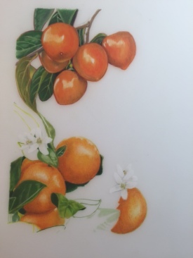
The oranges offered the challenge of having to work in a smaller scale while trying to represent the classic orange peel texture. After a few trials I found that using very tiny circular strokes with each layer of color, and no blending, resulted in a very pleasing appearance of texture. Here too, the Prismacolor Black Grape and Tuscan Red served very well for shading. Progress so far shown in the photo included.
I also tested time-lapse filming of the work in progress. I am still testing software programs and camera positioning. Hopefully I will have something worth posting this month.
